Hi! If you’re here, you probably already know that color is one of the most important elements in graphic design. It not just sometime tha attracts attention, is also communicates emotions, creates visual hierarchies, and reinforces brand identity. As a designer, understand the basic color theory isn’t a luxury; it’s a necessity.
In this guide you are going to understand the basic concepts of color theory in a clear way. No matter if you’re a novice designer or have experience but want to refresh your knowledge, you’ll find valuable information you can immediately apply to your projects.
Color Theory Fundamentals
Let’s start with the basics: what is color, really? Color is the interpretation our brain makes of the different wavelengths of light that reach our eyes. It doesn’t exist physically as such, but rather is our perception of the light reflected by objects.
There are three main types:
Primary Colors: These are colors that cannot be created by mixing other colors. In the additive system (RGB, used in screens), they are red, green, and blue. In the subtractive system (CMYK, used in printing), they are cyan, magenta, and yellow.
Secondary Colors: These are obtained by mixing two primary colors. For example, in the RGB system, yellow is created by mixing red and green.
Tertiary Colors: These result from mixing a primary color with an adjacent secondary color on the color wheel.
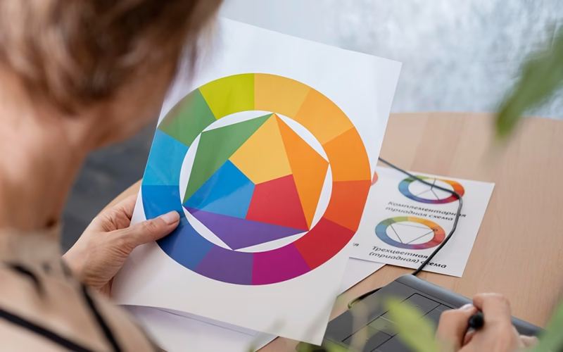
The Color Wheel
The color wheel is a fundamental tool for any designer. We keep this tool in mind when we need to create effective color combinations.
This wheel organizes colors sequentially following the visible spectrum, placing complementary colors in opposite positions. There are different types, from the most basic with 12 colors to more complex versions with hundreds of shades.
To use it in your work, simply identify the main color of your design on the wheel and, from there, you can find colors that harmonize following different schemes.
Color Properties
Each color has three fundamental properties that determine its appearance:
Hue: It is the color itself, which allows us to differentiate it from other colors (red, blue, green, etc.).
Saturation: Represents the purity or intensity of the color. A highly saturated color looks vibrant and alive, while a color with low saturation approaches gray.
Lightness/Brightness: Indicates how light or dark a color is. Adding white increases lightness, while adding black reduces it.
Adjusting these properties allows to create subtle or dramatic variations in my designs. For example, for an elegant brand, I can use less saturated colors with greater lightness, while for something energetic and youthful, I opt for more saturated colors.
Basic Color Schemes
Color schemes are predefined combinations based on the position of colors on the color wheel:
Complementary: Uses colors located at opposite ends of the wheel. You can use them if you want to create strong and vibrant contrast, ideal for highlighting elements. Example: blue and orange.
Analogous: Uses adjacent colors on the wheel. Use them to produce harmonious and serene combinations. Example: green, yellow-green, and yellow.
Triadic: Uses three equidistant colors on the wheel. They offer contrast while maintaining harmony. Example: red, blue, and yellow.
Monochromatic: Uses variations of a single color, playing with its saturation and lightness. It creates elegant and cohesive designs. Example: different shades of blue.
If you don’t know where to start, the monochromatic scheme is always a lifeline. It’s almost impossible to make a mistake, and the result is usually professional and clean.
Color Psychology
Colors are not neutral; they evoke emotions and are loaded with cultural meanings:
- Red: Passion, energy, danger, or love.
- Blue: Trust, calmness, professionalism.
- Green: Nature, growth, health.
- Yellow: Optimism, joy, attention.
- Black: Elegance, power, mystery.
- White: Purity, simplicity, cleanliness.
It’s important learn these meanings that change depending on the cultural context. For example, in the West white represents purity, but in some Eastern cultures it symbolizes mourning.
When you are designing,you constantly think about what you want to communicate and choose colors that reinforce that message.
Practical Applications
Theory only makes sense when applied. Let’s see how color works in different areas:
Web design
- Use contrasting colors for calls to action (CTAs).
- Maintain a consistent palette across all pages.
- Ensure text is legible on colored backgrounds.
Graphic design
- Choose colors that reflect the tone of the message.
- Use color to guide the visual journey.
- Create visual hierarchies through color contrast.
Branding
- Select colors that represent the brand’s values.
- Define primary and secondary colors for different applications.
- Verify that colors work both digitally and in print.
Digital Tools for Working with Color
Here are some tools I use constantly:
- Adobe Color: Allows you to create, explore, and save color palettes.
- Coolors.co: Generates random palettes that you can adjust.
- Color Hunt: A collection of palettes created by designers.
- Paletton: Creates color schemes based on color theory.
Most of these tools are free or have fairly complete free versions. My advice: save all the palettes you like; you never know when you’ll need them.
Common Mistakes and How to Avoid Them
After years of designing, I’ve made (and seen others make) these mistakes:
Accessibility Issues: Always check contrast to ensure that people with visual impairments can interact with my design. Tools like WebAIM’s Contrast Checker are essential.
Excessive Saturation: Using very saturated colors in large areas tires the eye. I reserve these colors for small elements or accents.
Too Many Colors: I limit myself to a palette of 3-5 colors to maintain consistency. If I need more, I use variations of those same colors.
Discordant Combinations: Before finalizing a design, I always check if the color combinations work following one of the mentioned schemes.
Conclusion
Mastering color theory is an ongoing process. As a designer, each project teaches me something new about how colors work and how people respond to them.
My final recommendation: experiment, observe the world around you, and analyze the work of designers you admire. You’ll see patterns and learn tricks that no guide can teach you.
Rules are important, but once you know them well, you’ll also know when to break them to create something truly unique.