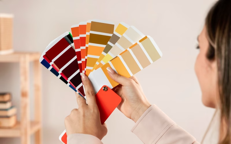
Have you ever wondered why you suddenly see the same shade of green everywhere? Or why stores are filled with the same coral color at the same time? It’s no coincidence. This are the famous colors of the year in action, and today I’ll tell you all about them and how you can incorporate them into your creative projects.
What are the Colors of the Year and Who Decides Them?
Colors of the year are chromatic selections that set trends and reflect the spirit of our time. Companies like Pantone, Benjamin Moore, and Sherwin-Williams announce their star color each year, a decision that greatly influences design, fashion, and decoration.
Personally, I always look forward to these announcements. They’re like a window into the future of design and help me stay updated on my creative projects.
2025 Colors of the Year
For 2024-2025, Pantone has selected Peach Fuzz as its star color, a soft peach tone that evokes warmth, comfort, and moderate optimism. This choice reflects our collective desire for comforting environments in times of uncertainty.
Meanwhile, WGSN opted for Apricot Crush, a more vibrant orange that symbolizes vitality and positive energy. Sherwin-Williams, on the other hand, designated Upward, a serene sky blue that invites calm and reflection.
Each of these colors has its own personality:
- Peach Fuzz creates a sense of warmth and closeness
- Apricot Crush conveys energy and optimism
- Upward invites serenity and mental expansion
Color Psychology Applied to Graphic Design
Colors are more than just visual elements, they are a great communication tool. For example, when peach tones such as Peach Fuzz are incorporated into designs, it automatically creates a sense of warmth and approachability.
On the other hand, blues like Upward evoke professionalism and stability, ideal for technology or financial services companies.
The fascinating thing about the colors of the year is that they are selected considering the global cultural moment. It’s no coincidence that after turbulent years, experts lean towards colors that convey tranquility and hope.
Practical Applications in Graphic Design
Here’s how you can effectively apply these colors:
In corporate identity
Integrating Peach Fuzz into a logo or secondary palette for a wellness or natural food brand can reinforce its values of warmth and authenticity.
On social media
Instagram carousels with Apricot Crush backgrounds generate greater engagement due to their vibrant energy. I’ve seen this with several clients.
In advertising
Upward works wonderfully as a background color to highlight clear and direct messages, especially when I want to convey reliability.
In e-commerce
Buy now buttons in peach tones have shown greater conversion for products aimed at younger audiences.
Techniques for Incorporating the Colors of the Year
You don’t need to redesign all your graphic material. You can strategically incorporate these colors:
As an accent: A touch of Peach Fuzz in key elements can completely refresh a composition without drastically altering it.
In gradients: you can create transitions from Apricot Crush to complementary tones for buttons and calls to action, with outstanding results.
Photography: Adjusting the temperature and tone of images to harmonize with the colors of the year creates impactful visual coherence.
In typography: Titles in Upward on neutral backgrounds create accessible contrast while maintaining the trend.
Common Mistakes and How to Avoid Them
Excessive saturation
Using Peach Fuzz in everything can be cloying. My recommendation: limit it to 30% of your composition.
Ignoring your audience
Although Apricot Crush is trendy, it can alienate a conservative corporate audience. I always validate my color decisions with audience research.
Forcing combinations
Not all colors of the year work together. I’ve discovered that Peach Fuzz and Upward can combine perfectly, but Apricot Crush needs more neutral contrasts.
Conclusion
The colors of the year offer an opportunity to keep your designs fresh and connected to the current zeitgeist. However, remember that they are trends, not commandments. Your creative intuition and knowledge of your audience should always guide your final decisions.
I’ve found that strategically incorporating these colors can completely revitalize a stagnant project. Try small accents, observe the response, and adjust as needed.
What are you waiting for to experiment with Peach Fuzz, Apricot Crush, or Upward in your next design?

