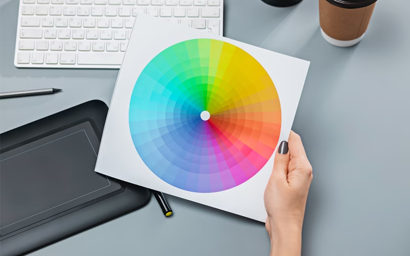
Choosing a color is a complicated process that requires careful design analysis, but choosing an entire color palette can be even more complicated.
How many times have you had to choose a color palette? I have, a lot! And selecting the right colors for each project, whether it’s a logo, a web page, an application or a flyer, is always an extremely important part of the project, even if, all things considered, fun.
But how do you choose colors for a project without wasting hours or even days? The “trick,” as always, is experience, that is, knowing how to do it.
In this article I have therefore included a series of tips personally tested to ensure that the choice of colors for a project is faster and more effective. I have divided these tips into basic tips , for those who are beginners or simply want to review the basics, and tips for NINJAs of choosing colors, which I hope will also help the more experienced!
Before you begin, remember: each type of project has different technical needs and your design choices must be consistent. For example, choosing the colors for a poster is different from choosing the colors for a logo.
5 BASIC Tips for Choosing a Color Palette
As I said, I decided to start with some basic topics. They are, yes, basic advice but it does not mean that you should ignore them, on the contrary! They are precisely those tips that allow you to have a solid knowledge on this topic and to deliver extremely functional projects to the client!
So, if you’re already a NINJA of choosing colors, you’ll have some dedicated tips later, but, in the meantime, how about a refresher?
1. Use standard combinations
Tip number one is the usual: if you don’t know what or how to do, keep it simple, start with the ABC. In the context of choosing colors in design, the ABC are the standard combinations, the basis of color theory. Very briefly, what does color theory say ?
Basically, every color is given by hue, which is the pure color, brightness, which is the amount of white or black in a color, and saturation, which is the intensity of a color. That said, there are three categories of colors: neutral colors (grayscale from white to black), primary colors (red, yellow, blue), and secondary colors that are generated by mixing primary colors.
OK, so knowing that, there are some standard color schemes that allow, especially for beginners, to create functional color combinations.
2. Don’t overdo the number of colors
Colors are beautiful, okay, and everyone likes colorful things, okay. But, like all beautiful things, you should never overdo it.
Okay, go ahead, but remember that a good color palette works much better when it doesn’t have too many colors. Why? Well, because each color sends a specific visual message to the viewer, and using too many of them risks confusing the viewer or not getting the intended message across properly.
Don’t worry, I’m not a purist of Swiss school design like Massimo Vignelli, and so I won’t tell you things like “you should only use primary colors” or “use a maximum of three colors for each project “. No, in everyday design and graphics, these are not suggestions, they’re bullshit!
This is because each project needs a different approach, a different way of thinking and therefore a different color palette. Which can be 2, 3, 5, etc. The important thing is to know how to moderate yourself and not use too many.
3. Use all the colors necessary
At the same time, each project to be expressed in its completeness, needs all the necessary colors. Be careful, this point does not contrast the previous point, on the contrary, it enriches it!
In fact, by moderating the number of colors used, you still need to use all the ones you need! For example, if you are making an illustration about, I don’t know, a landscape of my dear Liguria, like the 5 lands, you can’t avoid inserting some colors to characterize all the facets of the territory or the colors of the houses.
In short, use all the necessary colors but make sure there aren’t too many, the necessary ones!
4. Use the psychology of colors
The psychology of colors is something that every designer should always consider in every project.
When I talk about color psychology I am referring to all those theories according to which colors have different effects on people. For example, some shades of blue have a relaxing effect, dark green generates trust, orange stimulates creativity and so on.
There is no doubt that colors play a fundamental role within a project and this depends to a large extent on the effects that those colors generate on the observer, on his mind.
5. Consider your target
A color palette intended for a bank poster must obviously have very different characteristics than a color palette intended for an adolescent target.
Well done, but not only that! Consumer habits and preconceptions also influence a target.
Consumer habits are what lead us, for example, to look for shampoos in supermarkets through their bright colors. We are used to seeing shampoo packaging as very colorful packages and we also look for them thanks to the colors that identify them.
So if you are dealing with a highly habitual target you have two options:
- You conform (rework) and choose the colors that everyone else chooses (the competitors, in short)
- You stand out and do something completely different
People’s preconceptions are the cultural baggage that a person has regarding a certain color. You can be influenced by culture or by your own personal experiences. For example, in Western culture pink is associated with women, black with death and so on. And these are preconceptions to consider if you work with well-defined targets.
5 More NINJA Tips for Choosing a Color Palette
Here are 5 more slightly more advanced tips for those who are quite familiar with the world of graphics and design and for whom choosing the right color or palette is a daily routine. Ready?
6. Use photographs to create your color palette
My (and not only my) favorite method for creating a color palette is to start from a photograph.
On this note, there is a wonderful tool called Adobe Color (formerly called Adobe Kuler), which allows you to do this process of creating a palette in a super-fast and intuitive way.
However, Adobe Color is also available on mobile and is very convenient if you want to create a color palette using your phone’s camera. Again, once you’ve chosen a color scheme, it’s very easy to save it to your libraries and view it on all your devices connected to the Creative Cloud. Look for it on the App Store or Google Play.
7. Create an atmosphere
Understanding the psychology of colors, using photographs to create your own palette, are all aspects that must serve us designers to create, thanks to the colors used, an atmosphere in our project. Colors in design serve to create an atmosphere, to convey a message.
The objectives of the brand you are working for must guide the choice of colors. Certain objectives must correspond to certain design choices.
A very simple but, in my opinion, very effective example to make clear what I mean is what I tried to do with these two examples of posters and their consequent color palette.
8. Copy color schemes that work
“Steal like an artist ” is a very famous book by Austin Kleon. This book talks about how nothing is original, especially in the creative world, but everything is a simple remixing of what already exists. A reworking. A designer does not invent, he innovates!
Immature poets imitate; mature poets steal; bad poets ruin what they take, while good poets make something better, or at least something different, out of it. The good poet amalgamates what he steals into a complex feeling that is unique, absolutely different from what it was taken from.
The principles of Austin Kleon’s book can easily be applied to the topic we are talking about, right? How many times have you found yourself in front of a poster, an illustration or a website with perfect color palettes for your project?
I have often copied (in the way Austin Kleon described) palettes from other projects, then adapted some elements to the project I was working on. The trick is to copy and know how to rework, re-adapt! If you don’t improve what you copied, you are simply plagiarizing .
9. Try to be “The Purple Cow”
Immediately after advising you to copy the most effective color combinations, I will immediately tell you that sometimes it is better to try to stand out, to create unique combinations. In short, you have to try to be “the purple cow”
The purpel cow is a very famouse marketing book by Seth Godin. The principle behind this book and this title is to stand out! If, for example, you are on a train traveling in the countryside and you keep seeing white and brown cows, at a certain point you will stop looking at them and ignore them, but if, suddenly, you happen to see a purple cow, wow! You certainly don’t forget that one, do you?
The same theory can be applied in the world of design and in the choice of colors.
For example, one thing I’ve always noticed is that the posters and flyers for discos are all or almost all with a black background and white writing or “tacky” colors. If I had to design a poster for a disco night right now, I’d probably propose something totally different. I don’t know, I’d do a yellow and purple poster or something like that.
10. Practice, play, experiment!
This is one of my favorite tips for almost every topic I blog about! Because, to me, design is experimenting, trying, playing with shapes, combinations, and colors.
And play, understood as experimentation, is something that incredibly increases creativity and therefore improves the creative process. Play, try combinations that may seem senseless to you, experiment!