If you are working on a graphic design project that will go to print or if you have already tackled projects for printed materials , such as business cards, brochures or posters, you may have been told to use the CMYK color mode.
Managing color, measuring it, comparing it, defining it, is perhaps one of the most complicated but also most fascinating aspects for those who do graphic design.
Precisely because this is an issue that designers deal with every day, I think it is useful to explain as clearly and completely as possible what we mean when we talk about “color modes”. What is CMYK? When and how should you use it?
What does CMYK mean?
The acronym “CMYK” refers to the four colors that are used when working with this method and which allow all the others to be obtained.
In detail:
- C stands for cyan , so “cyan”
- M stands for magenta (in English it uses the same word as in Italian, so no need to translate!)
- Y stands for yellow , so “yellow”
- K, finally, stands for key black , the black channel needed to obtain a wider and more saturated variety of colors with this method (we’ll talk about it better shortly).
Since it is a method based on the use of four colors , in Italian it is often referred to as “quadricromia”. The different color components are more properly called channels.
When we talk about the CMYK color method, therefore, we mean a reference system in which all the colors we can create are obtained by mixing different quantities of light blue, magenta, yellow and black.
Quantities are measured in percentages: for each channel we will have a value between 0 and 100 .
When and how to use the CMYK color mode
The CMYK color method is the reference system we use when we indicate, through a code, which colors we want to obtain through typographic printing.
The colors in this type of printing are obtained by mixing the four different inks that correspond to the channels in the correct proportions.
When you mix colors made of matter – in our case ink, but also paint, pastels, etc. – what happens is very different from what happens when the colors you mix are made of beams of light, like on screens.
We are talking about physical phenomena that have a big impact on how colors are created and catalogued but also on their final rendering.
As regards the CMYK colour method specifically, the sum of colours intended as pigments occurs following the so-called subtractive synthesis.
What is subtractive synthesis?
During typographic printing, to obtain, for example, a green , the machines print, very close to each other, more or less large dots of cyan ink and yellow ink : the result is a color that will be less luminous than the two starting inks . This is because it adds the capacity of both to absorb (and therefore subtract) light.
When we refer to this phenomenon we actually speak of “subtractive synthesis”.
The same mechanism explains why, when we mix dyes or pigments in the colors cyan, magenta and yellow, what we obtain is a gray-brown, that is, a color with very low brightness. Try this: Move away from any light source and keep your eyes closed for a while. What color are you seeing?
Most likely it is not a true black, but rather a very dark and very poorly saturated gray. It is precisely the “zero level” of the retina, at rest and free from light stimuli, and it is very similar to the color obtained by combining cyan, magenta and yellow.
If mixing colored inks means losing brightness then perhaps you already understand what the main characteristic of the CMYK color mode is.
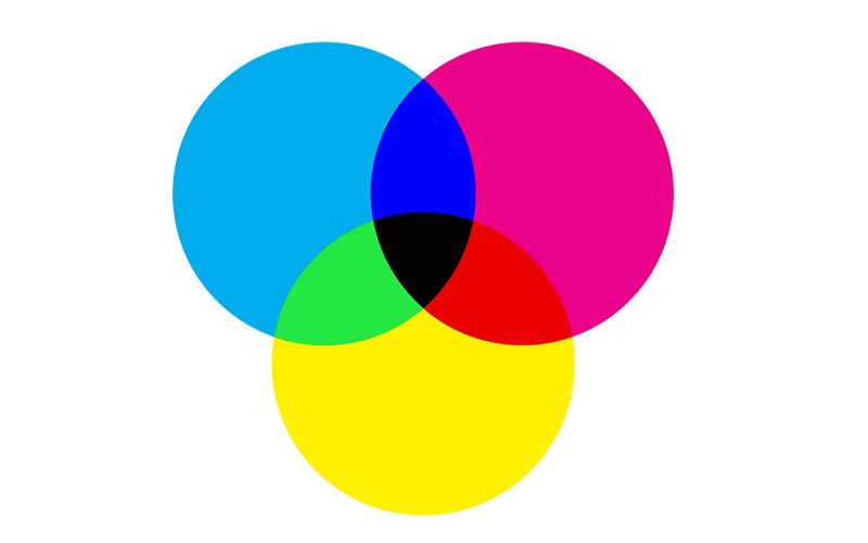
What colors can you get in CMYK?
Here is an infographic showing the basic combinations generated by the CMYK method
Due to its specific nature, with this method you will never be able to obtain all the colours you see on the screen (in fact, for projects intended for digital, the RGB colour method is used ), or particularly bright colours, such as fluorescent colours.
This is why, when we suggested the steps needed to best prepare a file for printing, we suggested that you work on your project right from the start by setting the color mode to CMYK. Otherwise, you risk having to redo the entire project because you discover that the colors you chose simply do not exist in the print.
Beware of black
As we mentioned at the beginning, the key black channel was added to the CMYK system precisely to obtain very saturated colors or a particularly bright black, which otherwise could not be created.
Adjusting the key black channel also allows you to obtain different shades and intensities of black.
For example, to obtain a black… simply black, the adjustment that comes naturally to set is this: C=0, M=0, Y=0, K= 100%. This is the “standard” black, which however, once printed, appears a little dull. It is perfect for text or for the outlines of figures.
If instead there is a full black fill, I recommend using the so-called “Rich Black”, which is obtained by setting these percentages: C=40, M=40, Y=40, K=100. This means that I add homogeneous percentages of all the other color channels to the key black to make the black I will obtain in print fuller.
Another interesting possibility is to vary the percentages of warm or cold colors that I add to the key black. In this way, the black that I obtain will also be colder or warmer, and can blend in, or on the contrary stand out better in a project with a predominant tone.
But what if, despite everything, CMYK isn’t the right method for your project? There are, of course, alternatives.
Color modes beyond CMYK
Four -color process is the preferred system for letterpress printing because it is the one that allows the greatest number of colors to be obtained with the least number of inks.
Today, however, in offset printing there are also machines capable of using, in addition to the four standard inks, up to 3 other colors (secondary colors: orange, green, purple) and therefore arriving at a print that is based on a method called CMYK+3. In this way, the range of colors available is greatly expanded.
However, if your project does not need to be printed, or this color method does not suit your needs, there are alternatives.
First of all, we have already mentioned the RGB method , which allows us to encode the colors we see through light sources, like all screens.
If, however, you have particular printing needs and want to obtain a specific colour, which does not exist in the CMYK gamut and which gives you the certainty of being perfectly compliant with your project, then the right solution is to use spot colours , such as the famous Pantone colours.