Since you are almost certainly reading this article through a screen. I’ll start by saying that you already know what the RGB color mode is , or at least you’ve certainly seen colors that fall within this range.
But if we come to the daily activity of those who deal with graphic design or creativity in the visual field. Knowing how the different color ranges work and knowing how to manage them in the best way avoids errors, wastes of time and improves results.
This is a topic that may seem obvious, but many questions always arise and doubts often arise.
In this article, then, we start from the basics so as to really explain in depth what we are talking about when we talk about the RGB color method. What you need it for in practice and how to best use it in your projects.
What does RGB mean?
The acronym RGB indicates the three channels. So in practice the three colours from which all the others within this colour method are obtained. In particular, this concerns
- R for red , so “red”
- G for green , that is “green”
- B stands for blue , in Italian “blu”
Be careful, despite the similarity of this triad, these are not the primary colors. Which are instead red, blue and yellow.
Since there are three basic colours that then make up all the others, we can also define this colour method as trichrome, as an alternative to quadrichrome which instead indicates the CMYK method.
By mixing light beams of these three colours in different percentages we are able to construct a very wide range , which also includes very bright, clear and saturated shades.
The greater versatility of this method compared to CMYK is due to the different physical characteristics of light and matter . I’ll explain it to you better.
Color-light: additive synthesis
When two or more beams of colored light overlap they create a new color , which will be brighter than the base colors from which it is formed.
This phenomenon is called additive synthesis. The classic example used to explain it is that of green and red light beams projected onto a white wall, which in the section where they overlap give rise to yellow.
The properties of additive synthesis mean that the RGB color method guarantees the possibility of creating a vast number of colors, even very bright ones, without the support of white or black as instead happens with the CMYK method which must use the key black channel.
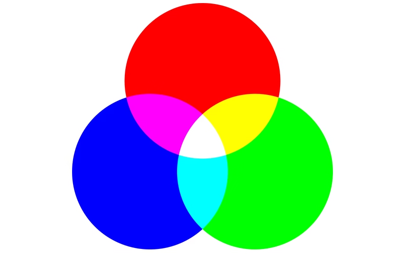
How RGB Colors Are Created
A short infographic that explains how two (or three) of the three colors of trichrome are used to create the others.
Whenever you work on a project based on the RGB color mode you create the different colors you need by acting on the red, green and blue values. In the RGB color method, each channel can be associated with a value ranging from 0 to 255.
Since this is a method based on additive synthesis (by adding color I add brightness) when all three channels are set to the maximum value , therefore 255, you get white. Conversely, when all three channels are at 0, you get black.
If you want to create gray in RGB you will have to set the same value for all three channels ; by varying the value you can obtain the entire gray scale. A lower value will correspond to darker grays , a higher value will correspond to increasingly lighter grays .
If, however, you want to explore the entire tonal range of a color, you can act only on that channel by modifying the value and keeping the others at zero.
To get all the colors that are not white, black, red, green or blue you have to act on the values of all three channels.
When to use the RGB color mode
As we said at the beginning, due to its specificities, this is the color method to set every time you start a project for a graphic or visual product that will be enjoyed on a screen. We are therefore talking about a very broad field of application, which includes:
- App and website design
- social media
- visual content such as video, graphics for digital environments, photography for websites, social media and apps.
As regards the branding side, we must pay particular attention to the management of the colour method.
In fact, if the visual elements that identify a brand, such as the logo or other graphic products, will be used digitally, obviously the correct method to work with is RGB .
But it is very rare, if not almost impossible, that a brand’s logo is never used on products made with letterpress printing, even if it is just business cards.
When it comes to designing something that will be reproduced both on screen and in print, therefore, you need to work on two different levels and always make sure that what you are choosing a color in RGB, can work equally well in an alternative color mode for different intended uses.
In this sense, if you use the most common design software from Adobe. Such as Illustrator and Photoshop, you can choose the color mode you want to use in the new document creation window.
If you want to change the color method while the project is still underway. You can do it in Photoshop, using the function Converti profilo, or in Illustrator from the menu colore. This conversion can be of great help to you in verifying that your brand image project can maintain the right impact through different means and supports.
Color modes beyond RGB
As I anticipated, the trichrome or RGB color method is the right one for all your projects that are enjoyed through screens.
As I anticipated, however, if what you create needs to be printed it is preferable to use other color methods. In particular, for typographic printing, four-color process, or CMYK color method, is usually used . It is called four-color process precisely because it is based on four channels : cyan, magenta, yellow and key black (the channel needed to obtain intense black).
In reality, today, when it comes to offset printing. You can also choose the method known as CMYK+3, since there are machines capable of using, in addition to the four standard inks, up to 3 other colours (the secondary ones: orange, green, purple).
If, on the other hand, you want to obtain a color through printing that does not exist in the CMYK gamut. Perhaps a color that you designed in RGB and that, once converted, seems unconvincing, you have another option . You can in fact use the color method that we define as “flat colors”; a very famous example of a color method based on flat colors is Pantone colors.
There are many colors outside of the gamut covered by RGB or CMYK
Conclusions
Correctly managing the color method in a graphic project. As you may have understood, is really important to work in the most effective way and to obtain the desired results.
Trichromy allows you to take full advantage of the potential of screens and digital tools. Knowing the world of colors is a fundamental skill to become a good graphic designer.